If you have not read it yet, please start with Create reports tutorial.
This tutorial introduces you to the main eazyBI chart types and shows exactly how to select data for these charts and change chart options. You can try to create charts using demo Sales Invoices cube.
We recommend first, build a report in a Table view and then select a chart type most suited for representation. You may read in the blog post how to pick the right chart type.
On this page:
- Bar chart
- Line chart
- Pie chart
- Scatter chart
- Timeline chart
- Map chart
- Gantt chart
- Gauge chart
- Boxplot chart
- Customize chart
| Table of Contents |
|---|
Bar chart
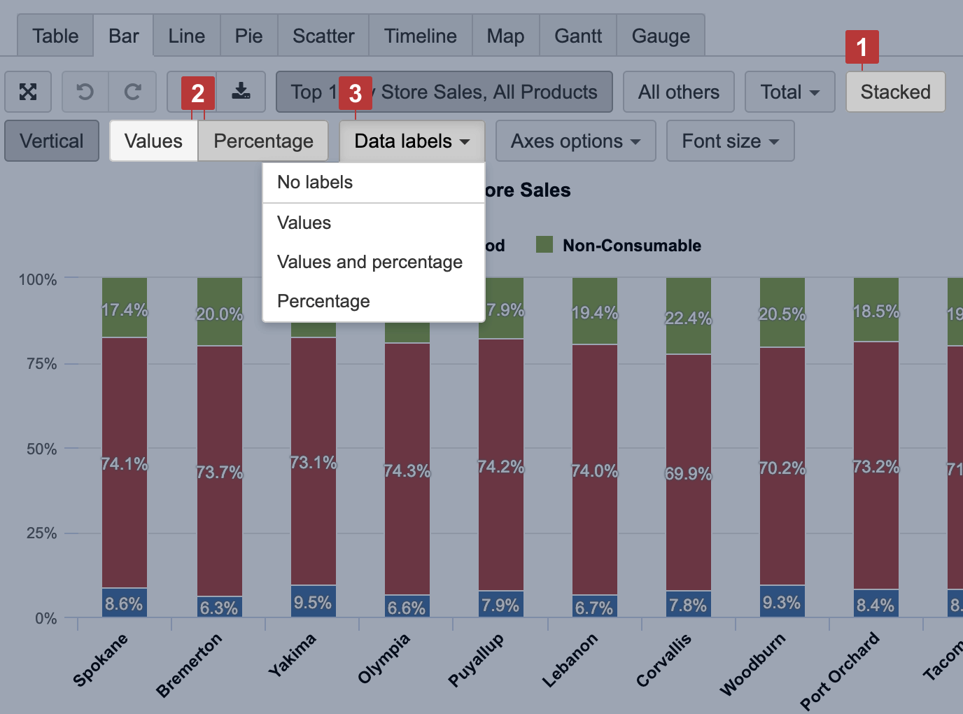
Select the Bar chart [1] to represent data comparison in columns or bars [3]. Select Stacked [2] to show a composition of similar items; you may have several stacks to group similar measures.
...
You can select more cluttered part of Scatter chart to zoom in.

Timeline chart
...
In a chart, you can select part of a chart to zoom in and see more details (a zoomed area is not saved in the chart) or you may Filter time to change represented period (a filter is saved in the report).

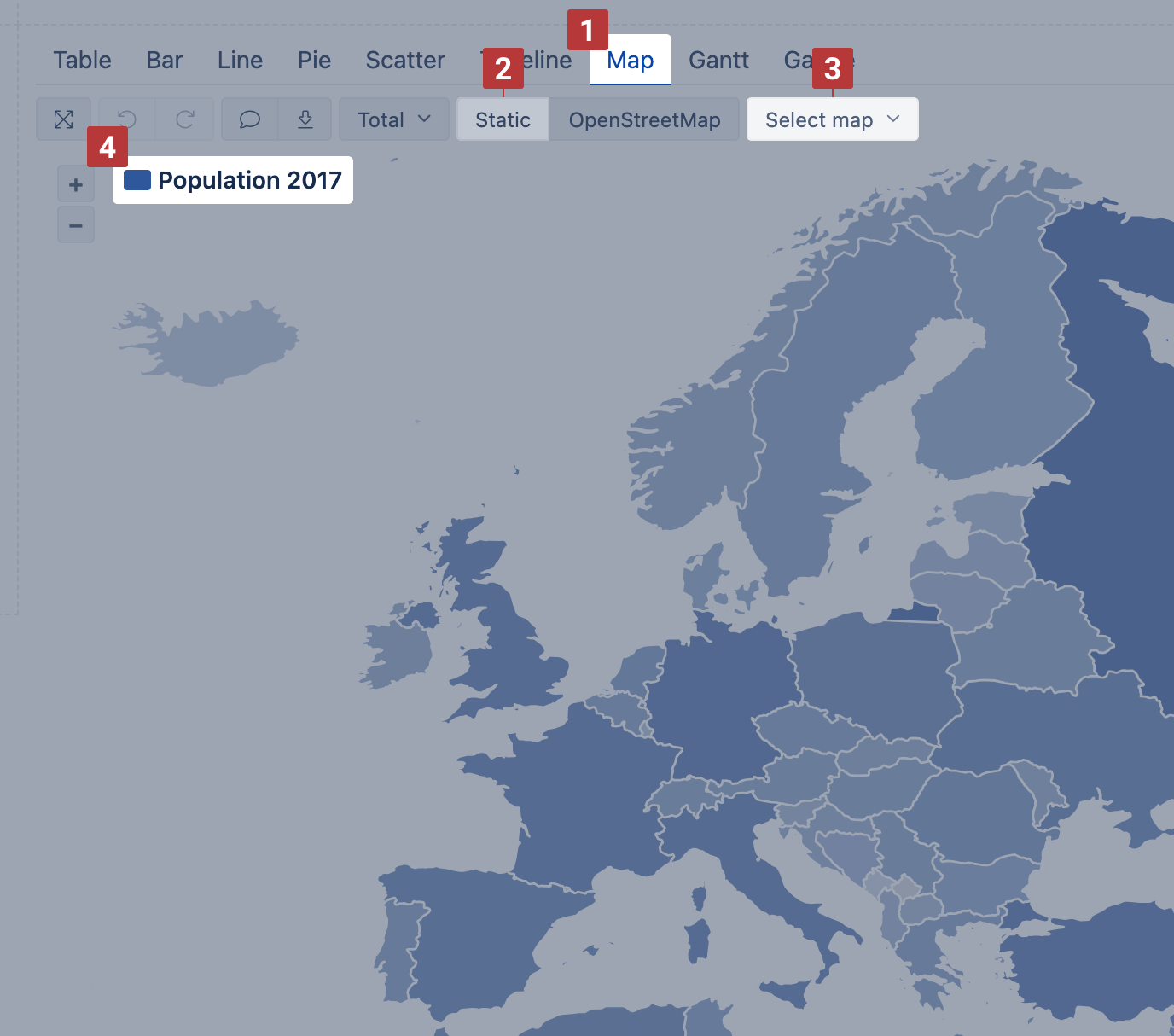
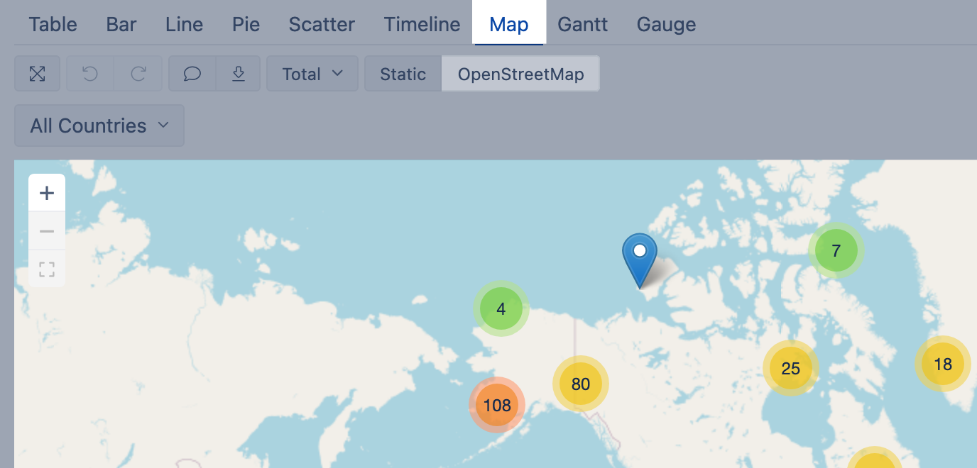
Map chart
If you have some dimension with countries or regions or data with geographical coordinates (latitude and longitude) you can represent data distribution on the Map [1] chart. eazyBI provides two types of maps.
You may visit Demo account to see both map examples: https://eazybiflex.combi/bi/accounts/2624147/dashboards/14324460-populationmaps-andwith-airportsgeocoding
Static map
Use Static map when you have regions mapped with the ISO two-letter codes or country names. If you map data with the country names, make sure that the used variations of the county names are recognized in the map chart by eazyBI.
Select dimension containing region and country two-letter codes [1] on rows and necessary measures on columns. The first column [2] is used to calculate color intensity for each region.
...
Then switch to Map [1] chart and select Static [2] view. You may also select the region [3], like, world map, Europe map or particular country map, to change between available maps. The region color intensity is calculated on measure value [4] from the first column. When hovering a mouse over the region, you see measure values from all columns.
Dynamic map
Use dynamic map when you have geographical coordinates (latitude and longitude) for dimension members to represent their location on the map.
Select a dimension containing objects with coordinates on rows and necessary measures and coordinates on columns [1]. The first column should hold latitude and the second column should hold longitude [2] to place coordinates correctly. Use some numeric measure [1] to give a context for the report; this measure might be as the third column or filter.

Then switch to Map [1] chart and select OpenStreetMap or Wikimedia [2] view to see how many objects (dimension members) are in each region.
Gantt chart
Select Gantt chart [1] to illustrate scheduled tasks and their progress on the timeline Daily, Monthly, Quarterly, Yearly or Fit width [2].
Fit width shows the less gradual selection where all the first start date and the last end date of any row fit in the screen.Weekly, Quarterly, Yearly and Fit width options are available starting from the eazyBI version 5.3 and on Cloud.
Select projects and tasks on rows and in columns select at least two date columns for the task start date and end date. Set the start date as the first column and the end date after that [3]. Optionally, you can choose completion percentage [4] in columns (this column measure should contain percentage formatting). Completion percentage should be in the range from 0% (a task not started) to 100% (task completed). If the completion percentage is less than 100% and the end date is in the past (before the current date), then the task will be shown as overdue.
...
To see an overview, you can use numerical values only [3], and for big numbers select Scaled values [4] to display values using k (thousands) or M (millions) suffixes. Additionally, add a Sparkline calculated measure to show a brief trend next to the number.
...
- minimum (for calculations use function Min)
- first quartile (for calculations use function FirstQ)
- median (for calculations use function Median)
- third quartile (for calculations use function ThirdQ)
- maximum (for calculations use function Max)
The central rectangle spans the first quartile to the third quartile; a segment inside the rectangle shows the median and "whiskers" above and below the box show the locations of the minimum and maximum.
...
Go to Bar chart view and for the first measure select type Boxplot.

Customize chart
You can customize the way measures and dimensions are displayed in a chart, and create mixed type charts.
...
For measures with different units, for example, like sales and margin rate, it would make sense to display them on Separate axes to better see the coloration and with varying Types of chart to understand the distinction. You can also change the Color which resonates better with selected measurement nature.

Axes options
Choose Swap axes to swap dimension and measure placement on X and Y axis.
Use Axes options to provide additional information and improve chart readability. You can set Title and Label prefix and suffix for each axis to describe the metric, for example, that measure value represents Sales amount in USD. You can set Min, max and step for data grid to focus user attention on a particular value area.

Data representation
...
You can choose to show relative data comparison as Percentage [2] for Stacked [1] items in Bar and Area charts. You can represent each proportion value as numbers and as a percentage [3] of the whole bar.This customization is available starting from the eazyBI version 5.2 and on Cloud.