If you have not read it yet, please start with Create reports tutorial.
This tutorial introduces you to the main eazyBI flex.bi chart types and shows exactly how to select data for these charts and change chart options. You can try to create charts using demo Invoices cube.
...
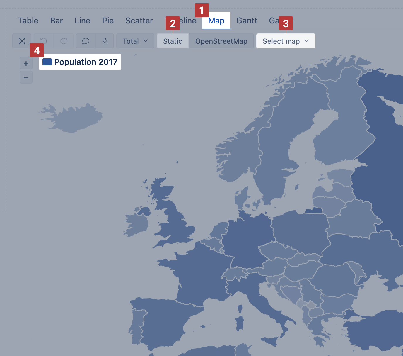
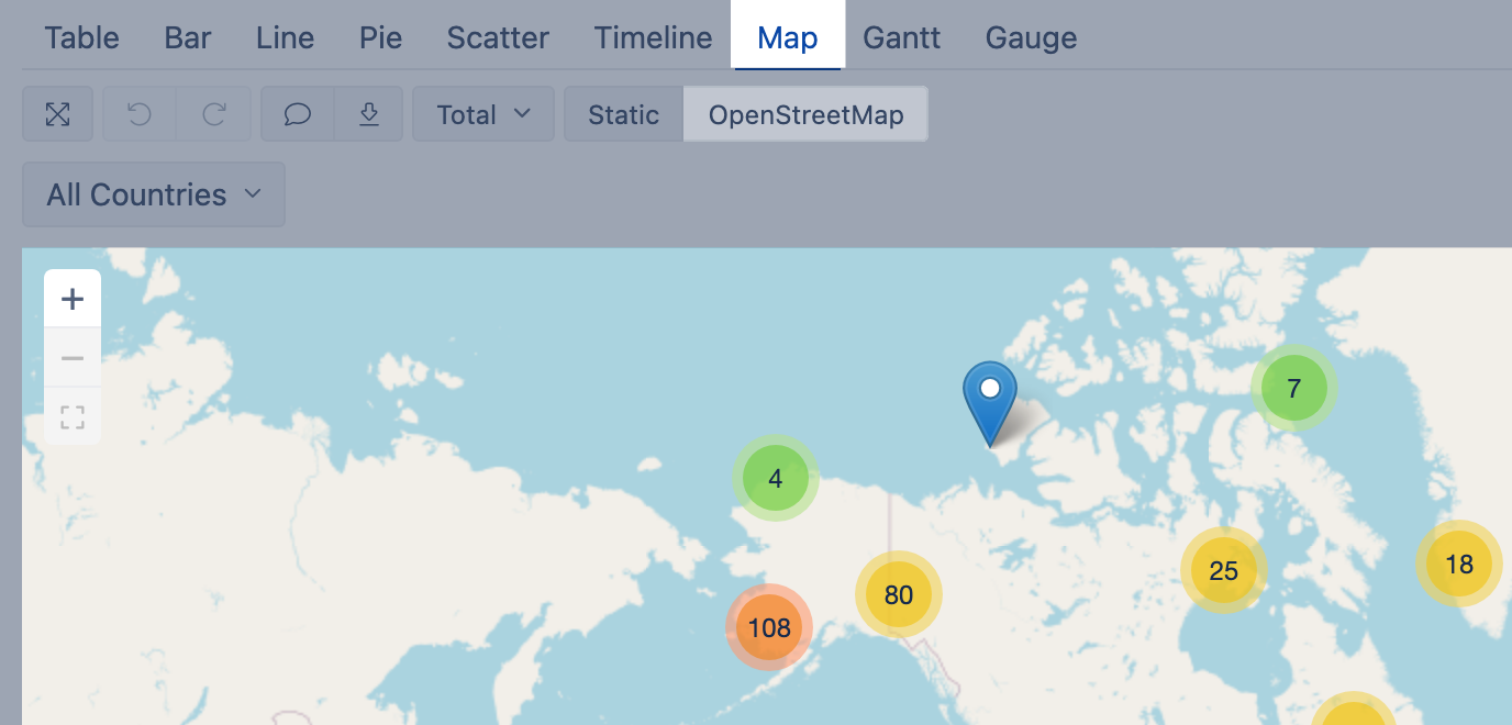
If you have some dimension with countries or regions or data with geographical coordinates (latitude and longitude) you can represent data distribution on the Map [1] chart. eazyBI flex.bi provides two types of maps.
You may visit Demo account to see both map examples: https://flex.bi/bi/accounts/47/dashboards/460-maps-with-geocoding
Static map
Use Static map when you have regions mapped with the ISO two-letter codes or country names. If you map data with the country names, make sure that the used variations of the county names are recognized in the map chart by eazyBIflex.bi.
Select dimension containing region and country two-letter codes [1] on rows and necessary measures on columns. The first column [2] is used to calculate color intensity for each region.
...
Then switch to Map [1] chart and select Static [2] view. You may also select the region [3], like, world map, Europe map or particular country map, to change between available maps. The region color intensity is calculated on measure value [4] from the first column. When hovering a mouse over the region, you see measure values from all columns.
Dynamic map
Use dynamic map when you have geographical coordinates (latitude and longitude) for dimension members to represent their location on the map.
Select a dimension containing objects with coordinates on rows and necessary measures and coordinates on columns [1]. The first column should hold latitude and the second column should hold longitude [2] to place coordinates correctly. Use some numeric measure [1] to give a context for the report; this measure might be as the third column or filter.

Then switch to Map [1] chart and select OpenStreetMap or Wikimedia [2] view to see how many objects (dimension members) are in each region.
Gantt chart
Select Gantt chart [1] to illustrate scheduled tasks and their progress on the timeline Daily, Monthly, Quarterly, Yearly or Fit width [2].
...