...
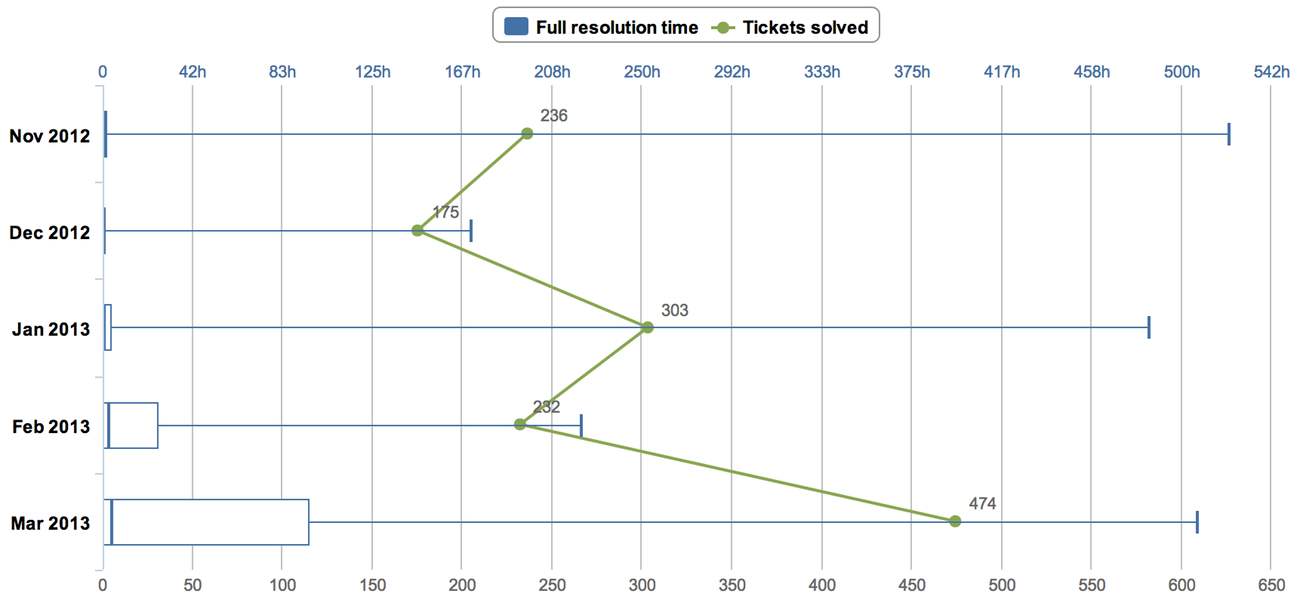
Box plot chart is a convenient way of graphically depicting groups of numerical data through their five-number summaries: the smallest observation (minimum), lower quartile (Q1), median (Q2), upper quartile (Q3), and largest observation (maximum).
eazyBI flex.bi Zendesk import will create “Sample ticket resolution time range” sample box plot chart which will look similar to this:

To create similar box plot chart you should do the following steps:
...