Support center for flex.bi version 4.0
Which chart type to choose?
| Table chart | Bar chart | Line chart | Pie chart | Gauge chart |
|---|---|---|---|---|
|
|
 |
|
|
| Special timeline chart | Scatter and Bubble chart | Mixed chart | Gantt chart | Map chart |
|
|
|
|
|


Flex.bi also supports custom JavaScript charts such as HighCharts.
Table chart
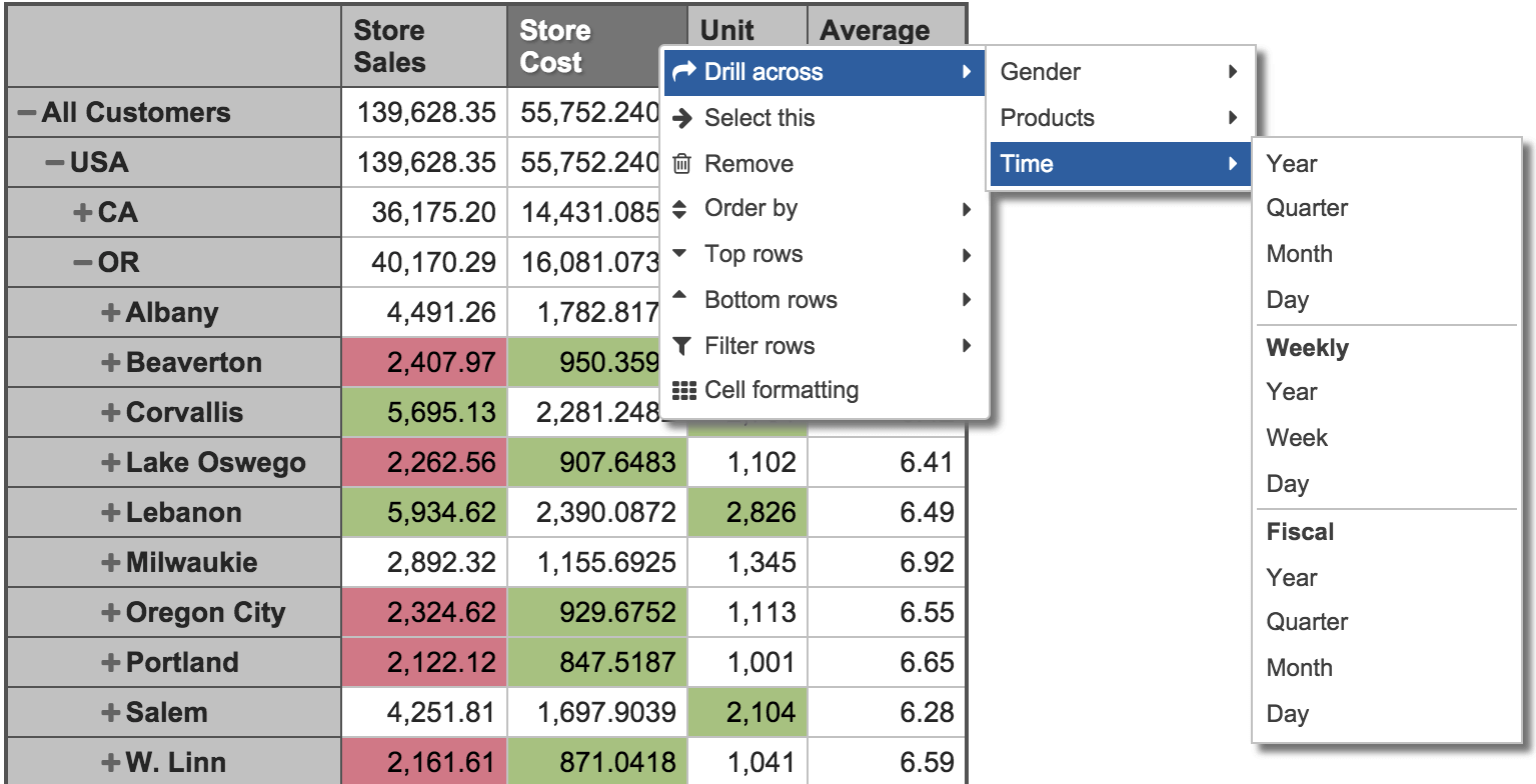
Drag and drop your columns, delve into details or across dimensions, set conditional formatting, create your filters or set limits.
Bar chart
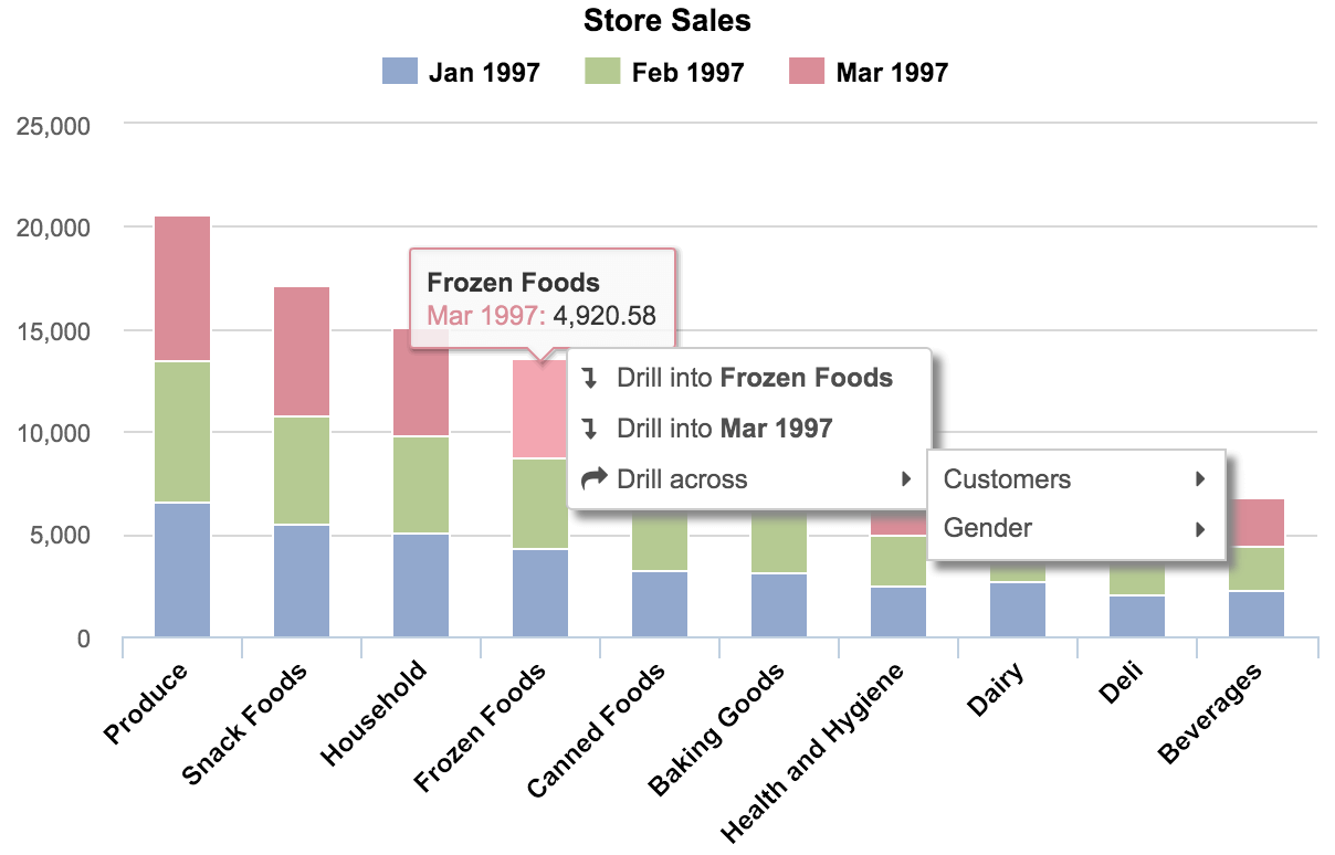
Switch between vertical or horizontal, stacked or un-stacked — all with a click.
Change colors, labels and separate axes to highlight the data you need.
Create combo charts by combining different chart types.
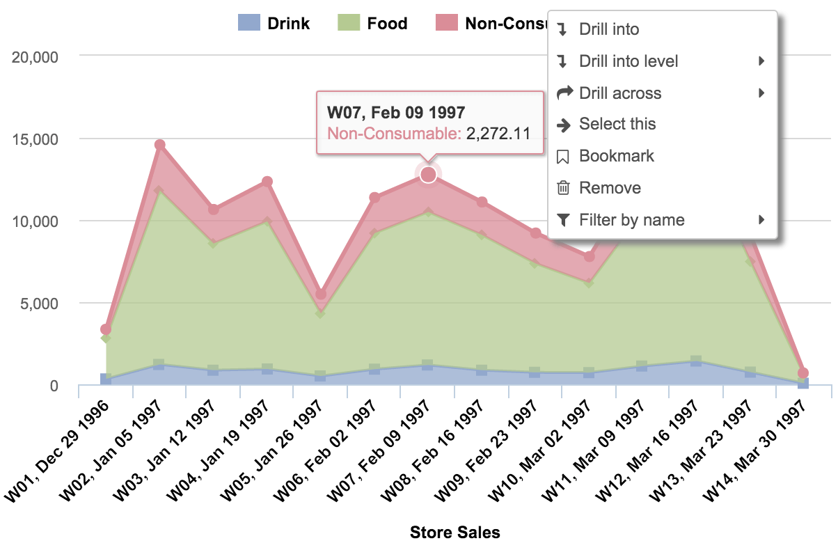
Line chart

Compare several categories at once to see how they perform.
Choose between line or area to highlight your data, or create a stacked area chart to display composition and a detailed trend.
Change colors, labels, and separate axes to make your comparisons more effective.
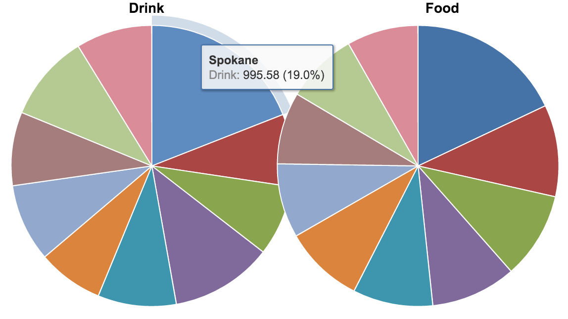
Pie chart

Illustrate a sample break down in a single dimension, or add more dimensions by creating a donut chart.
Gauge chart
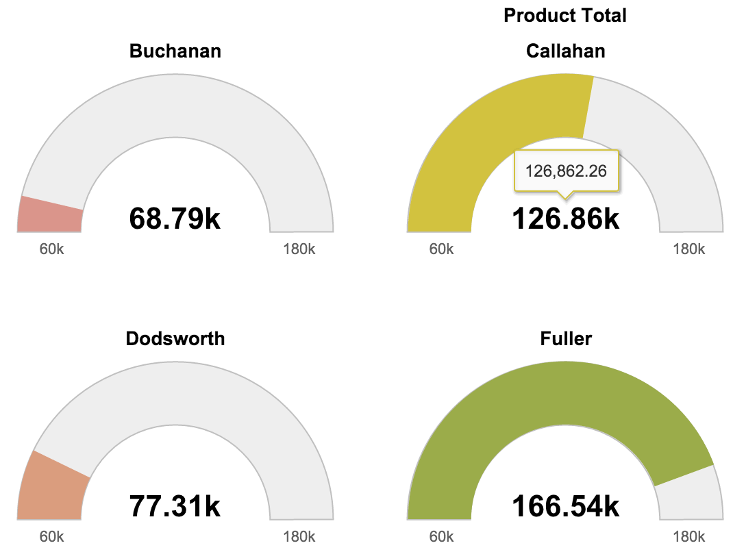
A Gauge Chart is a quick way to keep your finger on the pulse of your business.
Set your own Gauge limits or add powerful filters.
Drill into details or across different categories.
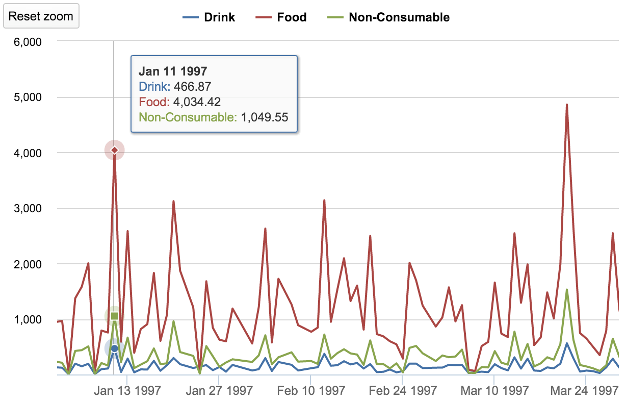
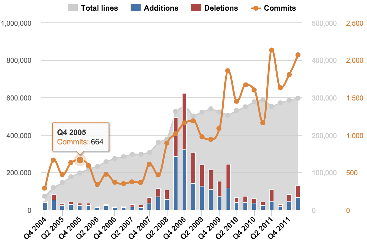
Special timeline chart

The Timeline Chart is a very special chart type that lets you zoom in and out with a simple click and drag, selecting an exact time frame.Set a specific time filter using common language, like “30 days ago.”
Select any data point and drill into more details with a click.
Choose between line, spline, column, or area chart types, and switch between stacked and un-stacked area or column charts to compare or evaluate.
Scatter and Bubble chart
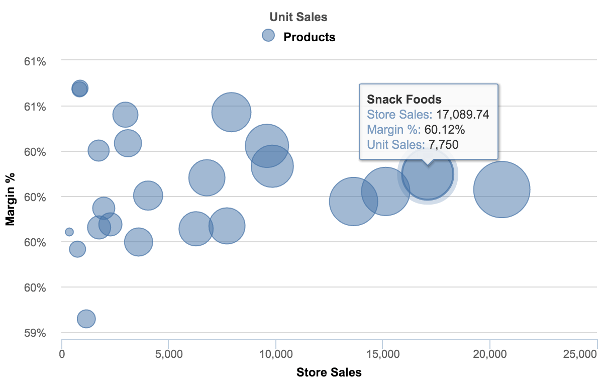
Clearly display the relationship between elements based on two variable parameters using a scatter chart, or add another dimension and create a bubble chart.
Quickly and easily drill into details or look across dimensions to see data distribution from different angles.
Mixed chart
Create visually appealing and easily comprehensible charts by mixing and matching different chart types.
Start with a basic bar chart and add different chart types to the mix
Choose between different colors or point-symbols to highlight the key points.
Map chart
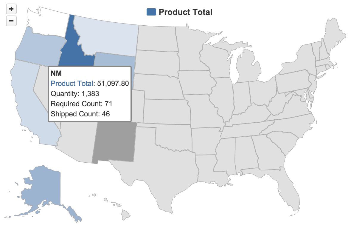
Switch between World map and Europe, or choose a specific county to see your regional distribution.
Hover your mouse over a certain area to see related information.
Select between a static map or another map type, such as OpenStreetMap or MapQuest, to see a more visual geo-location-based distribution chart.
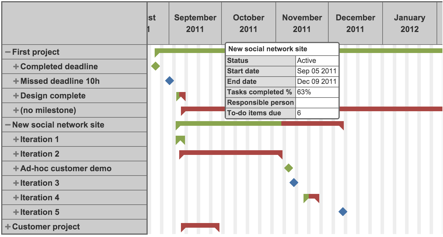
Gantt chart

Switch from monthly to daily view to see up-to-date details and mouse-over any task to see all related information.
Set filters and quickly check individual projects, employees, tasks, and statuses to identify all open, overdue actions, and to see individual performance.