Support center for flex.bi version 3.2
Creating charts
- Juris Aidma (Deactivated)
- Laima (Deactivated)
- Former user (Deleted)
If you have not read how to Analyse and create reports then please start with the Creating reports tutorial.
This tutorial will display the main flex.bi chart types and explain how to select data for these charts and change the chart options. You can try this in our demo installation (Contact us if you would like to try the demo).
Bar and line charts
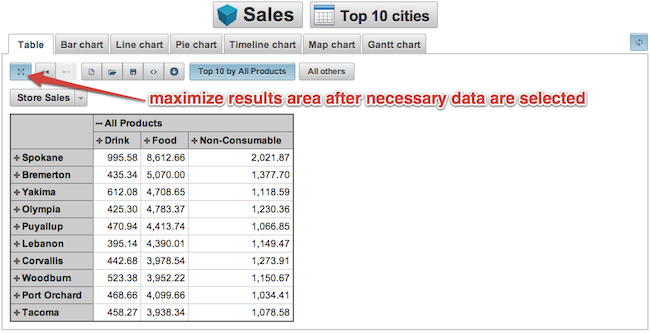
Before creating a chart it is always better to use the Table tab to select necessary data and then maximise the results area.
After the necessary data is selected then switch to the "Bar chart" tab and experiment with different bar chart options to find the best visualisation of your data.
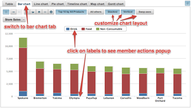
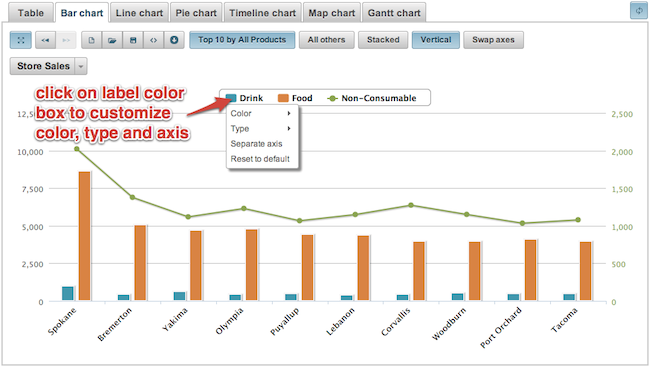
You can also customise how individual measures are displayed in a chart and create mixed type charts.
Pie chart
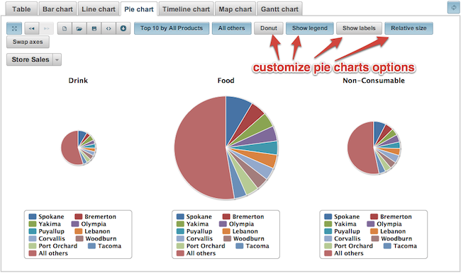
In a similar way data can be also visualised in pie charts.
Timeline chart
If you want to display changes or measures over time, then you can use the timeline chart which provides easy way to navigate to different time periods.
At first select the time dimension corresponding to hierarchy level you desire (days, weeks or months) and place it in the rows section and then place necessary measures on columns.
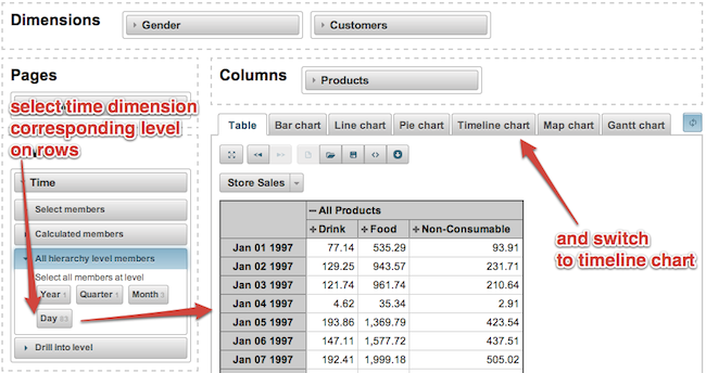
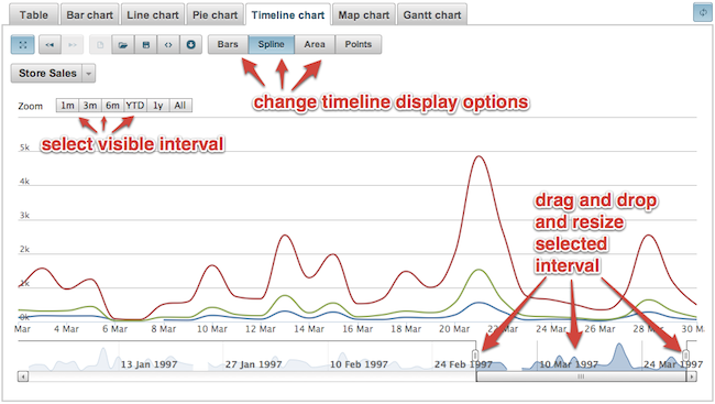
When you have selected all of the data, switch to the Timeline chart tab and select the necessary time period and change the display options for measures (as lines, bars, areas or points).
Map chart
If you have a dimension which contains data about countries or regions and you would like to visualise some measure on a map then you can use a map chart.
At first select the corresponding dimension (e.g. Customers dimension in Sales demo cube) and select the country or region level on rows and place the necessary measures on columns (the first column will be used to calculate colour of the region on a map).
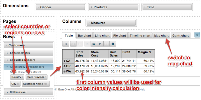
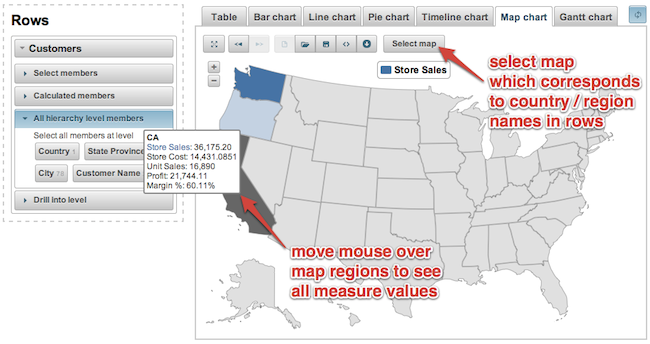
And then switch to the Map chart tab and select corresponding map (world map, Europe map or particular country map). If you need additional country maps then please contact us.
Calculated members
After learning how to build basic graphs - learn how to use more advanced features - Calculated members. They will allow you to create your own data from existing members.