Support center for flex.bi version 4.0
How to setup Gauge charts?
Gauge charts with constant limits
See Sample Report using Gauge charts In our Templates Library
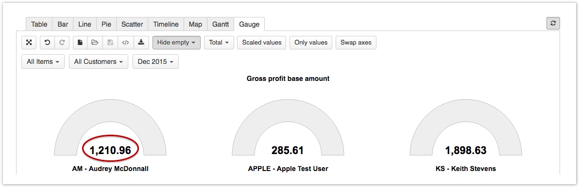
To add the same limit for all gauges, click on the common measure name
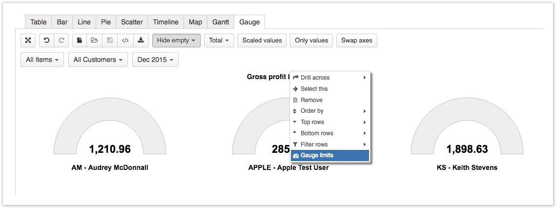
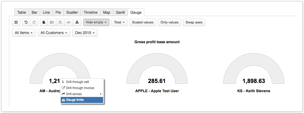
To add individual limit for a gauge, click on gauge value.
Select Gauge limits
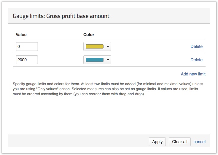
Select minimal and maximal value for gauge limits. You can add more limits and select colors for them.
Gauge charts with existing measure limits
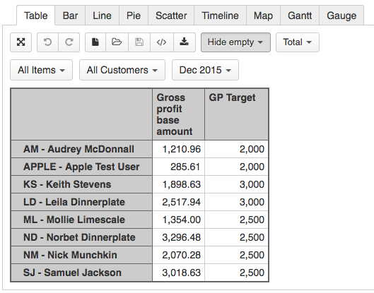
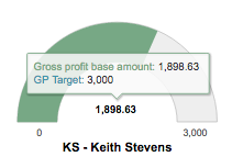
If you have a Measure that is imported as a target (for example, monthly sales target), you can add this target to your gauge chart.
You can import target values from Excel or CSV file.
Select the Measure and Target, that you want to analyze. Check in table, if they are correct.
Go to gauge tab.To add the same limit for all gauges, click on the common measure name
To add individual limit for a gauge, click on gauge value.
Select Gauge limits
Select measure for your gauge limits and select colors for them.
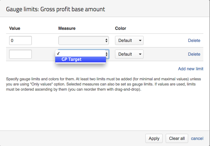
Select colors for the limits or leave the default colors
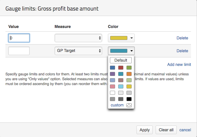
You can add more limits and select colors for them. You have created gauge chart with Target measure limits.
In this page
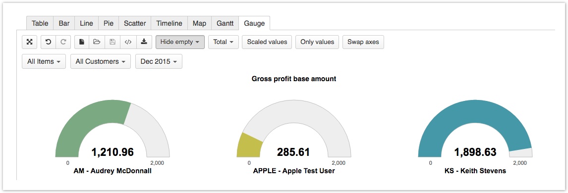
When to use Gauge charts ?
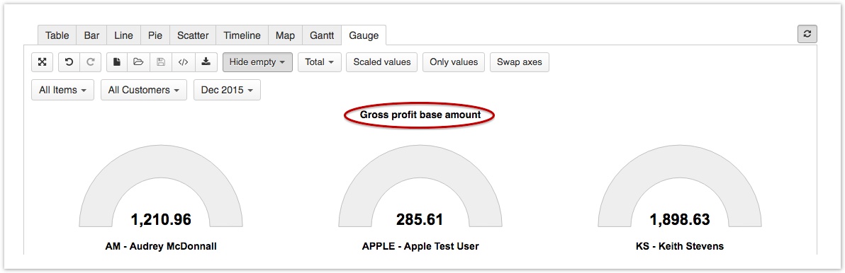
Gauge chart can be used to show several key performance indicators and define the limits for these indicator values and corresponding color coding of the gauge. Before creating charts, learn how to create reports.
See Sample Report using Gauge charts In our Templates Library
You can export definitions of the template reports.